PropelAuth – Auth
for B2B startups
A fast and straightforward authentication process
Services
Research – User feedback and competitive analysis
Customer journeys and user flows
Wireframe
Design system
User interface design
Website design
Platform
Web application
Website
Product
PropelAuth offers an end-to-end authentication for B2B companies. It has a fully customizable authentication process and advanced level of features with fast and straightforward integration.
The problems to be solved
When I first met the founder of PropelAuth, Andrew, he wanted to work especially on redesigning the interface and adding new features to be included in short-term plans.
After the first meeting, it was revealed that PropelAuth has no design system and there are also some usability issues and problems to be solved in the user flows. So, we added these points to the project plan, as well.
I was directly working with Andrew on this project. He is a software engineer who worked as a lead engineer at several big tech companies before he was willing to turn back his passion of coding and became a YC alumni in 2022. The need to have a straightforward authentication app for a specific project he was working on was the reason of founding PropelAuth. He is one of the most well-organized and dedicated person I ever worked with.
During our project, PropelAuth received new funding which motivated us to scale up the scope of the project around new features.
Research
Product review
I dedicated the first week to product reviews by myself and with Andrew. After the review sessions, I re-created the information architecture and made a list of potential problems in the user flows.
Competitive analysis
I have chosen competitors to analyze from different varieties of complexity, the number of users, company sizes, and product goals.
So, I made detailed research among the industry leaders and new comers; AuthO, Okta, Clerkdev, Frontegg, and FusionAuth.
Both product reviews and competitive analyses also helped me to build my domain knowledge on authentication products and problems.
User feedback
PropelAuth already had users and a pool of user feedback and support questions. The feedback pool aligned with the problems I defined in the product reviews. On the other hand, the questions received so far were about new feature requests. Most of them were fitting the short-term product plans.
User interview
I created a small user interview group consisting of a head of engineering and a lead data scientist. They are the colleges in my network who voluntarily joined the interview sessions. The reason that I have particularly chosen them is that they both had a lot of experience with B2B and authentication products both at the user and management levels.
Hacker News Launch
PropelAuth had an HN launch during the project.
Launch HN is a way for YC startups to launch on Hacker News.
The process is curated and involves working with the HN team to craft a text that we hope will interest the community.
News Y Combinator
The threads at the launch showed:
- The importance of advanced features with quick integration without becoming an auth expert
- The problems defined in the user flows are valid and urgent
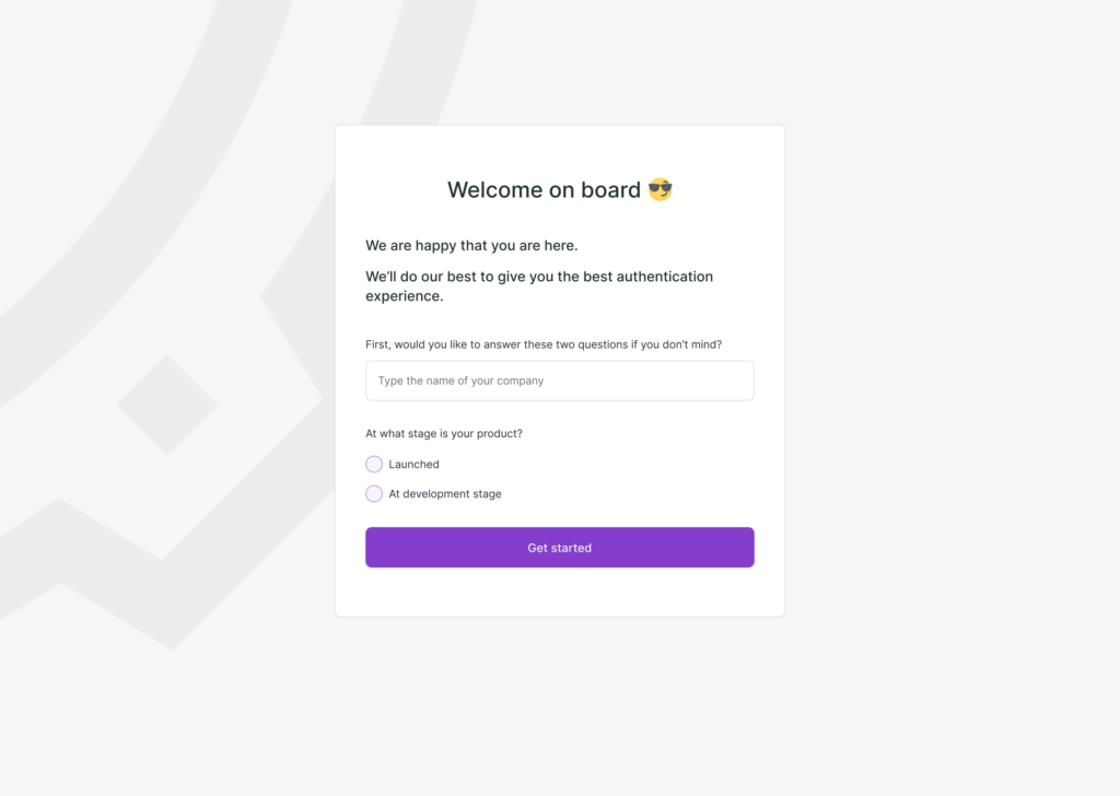
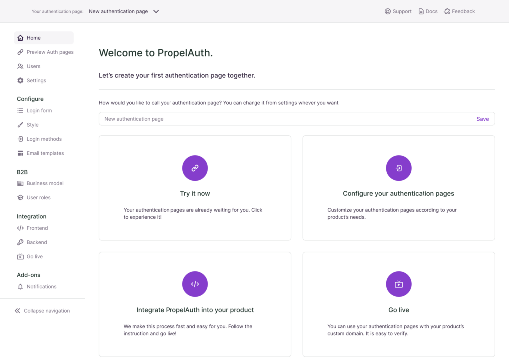
The Goal
- To improve the user flow of the organizational structure
From the analysis, user feedback, and product review I found out that the most important feature in the app that needs a better user experience is the structure of having multiple organizations in the product that uses PropelAuth as an authentication system.
- To define customized user roles and permissions
The user interviews and HN threads show that the ability to create custom user roles and permissions was at the top of the list of new feature requests.
- To create a design system with enhanced branding
PropelAuth was not using a design system. The product even did not have a branding.
- To redesign the user interface
The product required an intuitive interface design with industry standards.
Roadmap
Working on customer journeys to create user flows
Wireframing all the screens of the app
Creating a branding and design system
Redesigning the interface
Customer Journeys
Thought process
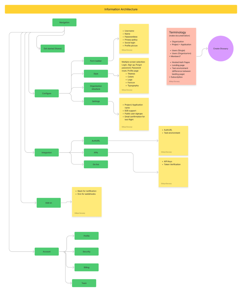
I gathered all the outcomes in a FigJam file to work on the thought process.
I made a list of:
- The problems to solve
- The questions to answer
I also documented the main product goals, product monetization model, and brand adjectives to guide us in the process.
The starting point was to work on the information architecture in order to list the various customer journey scenarios.
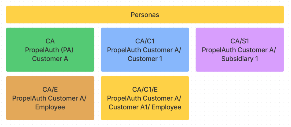
User personas
The tricky part was thinking of two separate potential user groups,
- the PropelAuth customers who will use the app to create their authentication system
- The PropelAuth customer’s customer who will use PropelAuth’s authentication URLs to sign up for the product of PropelAuth’s customer
I preferred to use diagram-like personas instead of classical personas for the sake of clarity.
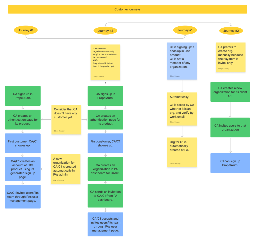
Defining customer journeys
Andrew and I spend a considerable amount of time at this stage. My goal was to ideate on all possible scenarios.
When a user (PropelAuth customer aka CA) can create organizations manually?
What happens when CA doesn’t have any customers yet?
What happens if CA creates multiple organizations after getting customers’ sign-ups?
How does a CA’s user (C1, PropelAuth customer’s customer) invite its team to use CA’s product via PA (PropelAuth) user management pages?
etc.
The customer journeys led us not only to create user flows of the product but also helped us to ideate on multiple organization structures and feasible user permission/ roles.
Wireframes
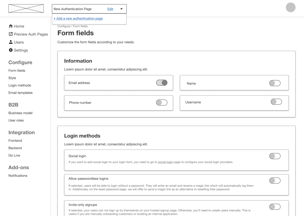
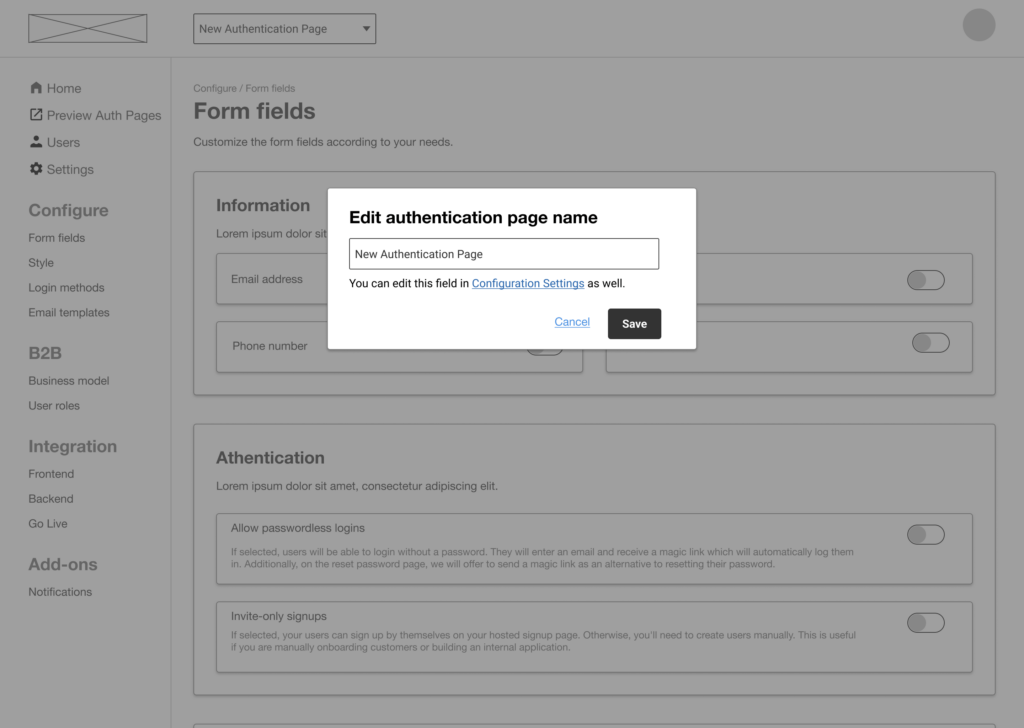
I usually don’t rush on the wireframe stage, especially when we don’t have an established design system since detailed wireframes make it a lot easier to work on the UI stage.
I start with working on the grid layouts which becomes then an element of the design system, as well.
I walked through each screen with Andrew and turned them into high-fidelity wireframes so that I can group the content into component libraries in the design system.
I found new areas to improve such as creating multiple projects, working on test vs live users, onboarding, and account and profile management at this stage.
Design system
PropelAuth didn’t have a brand system either. There was only a logo as guidance and the brand adjectives we decided on at the beginning.
I offered Andrew to create a design system that also includes branding elements.
Creating a design system from scratch requires planning, forecast, and flexibility.
Wireframes are the best support and guide for that.
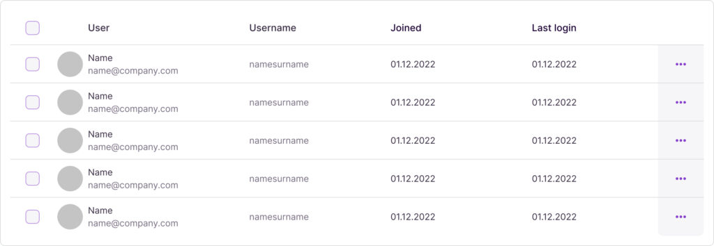
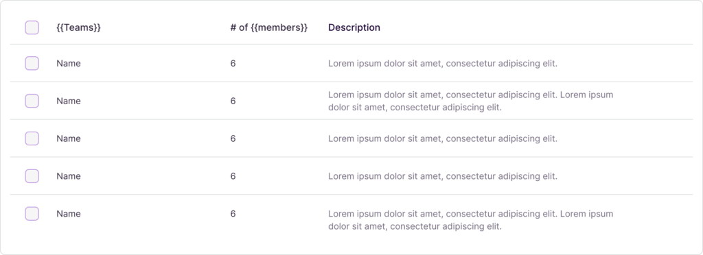
For instance, it was understood that PropelAuth has a lot of pages that contain data tables:
- Users table
- Account management
- Team management
- User roles
- Domain management
They have a lot of common data. For the sake of consistency and practicality, I added a table component in the design system that contains three different variations;
the type of the table (the list above)
the states that have hovered, empty, and open states
and the size, for both desktop, and tablet.
UI
For a designer who has high-fidelity wireframes and such a rich component library, designing the interface is like eating ice cream! It is fun, fast, and straightforward.
Nevertheless, there were three main parts that I had to pay extra attention to:
- Customization pages for the hosted authentication URLs
- Organization structure design page
- C1’s (customers of PropelAuth customers) account and profile pages
Although I worked so hard on the wireframes, some iterations are inevitable while designing an intuitive interface.
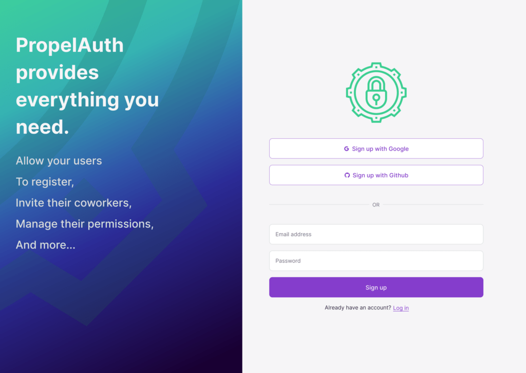
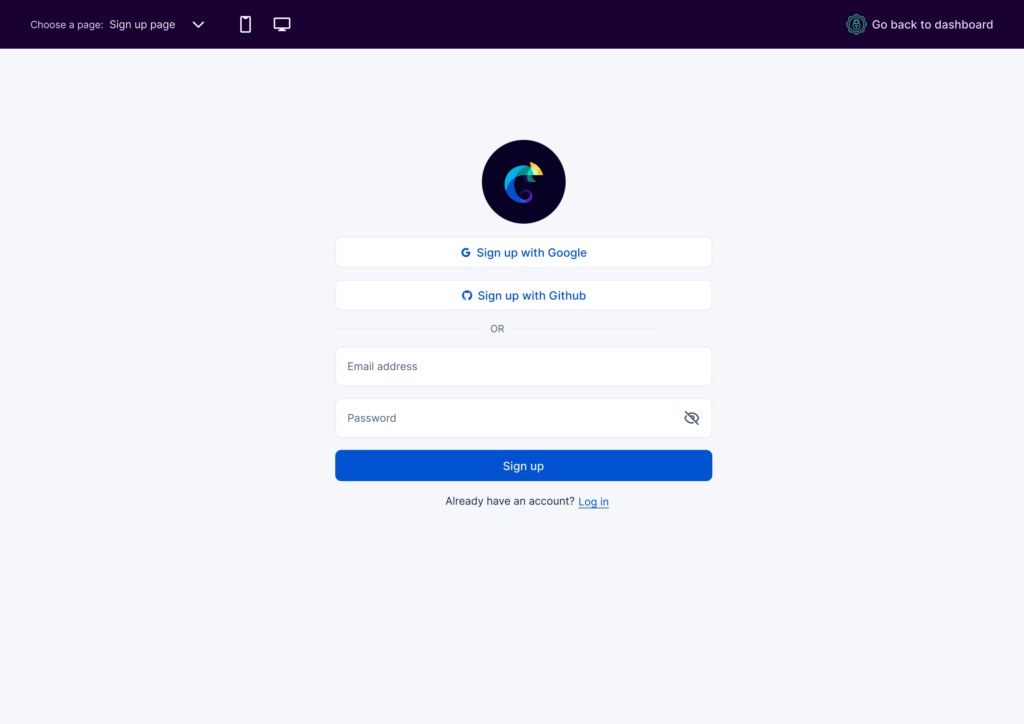
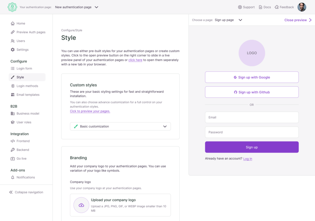
Authentication page customization
Those are the pages that C1 will utilize while using CA’s (PropelAuth’s customer) product.
PropelAuth had to offer an out-of-package solution for those who do not prefer to work on advanced customizations.
But for those who are willing to spend some time on customization so that the hosted pages fit their product branding, it had to be advanced but not complicated.
Here is my solution:
Organization structure
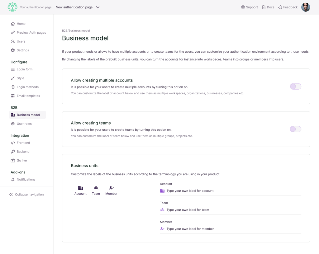
I analyzed various B2B products with the ability to create multiple accounts, like Figma, Slack, Trello and Github.
We had discussions and idea sessions on different models, and I decided on a simple way based on the common properties of multiple organizational structures.
It is possible to create a complex organizational structure with only two simple questions:
- whether CA allows or not multiple accounts
- whether CA allows it or not create teams
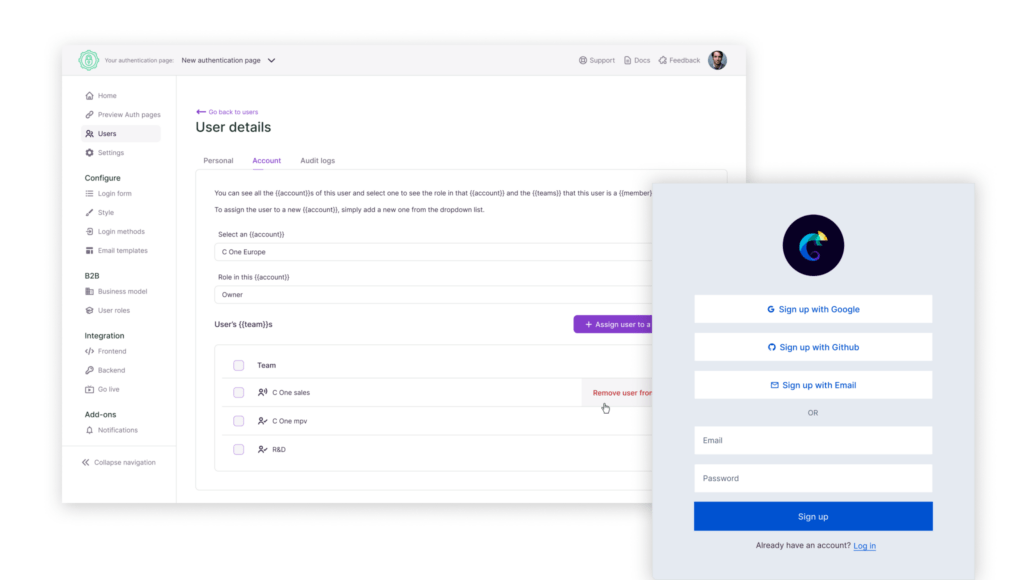
Account and profile pages
As for functionality, I separated account and profile settings in the information architecture where they were managed under the same page before.
Account settings are for organization-related subjects such as adding or editing teams within that organization or removing/inviting users to the account as well as assigning user roles.
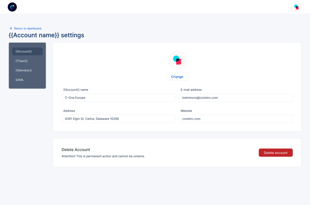
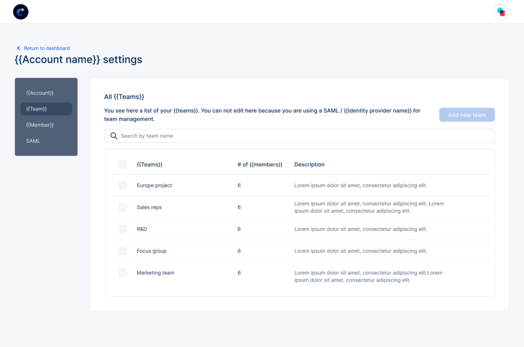
On the other hand, profile settings are only for personal info such as basic information, roles, accounts, and teams to which that user belongs. That way, it was also possible to allow users to manage the pages according to their roles and permissions.
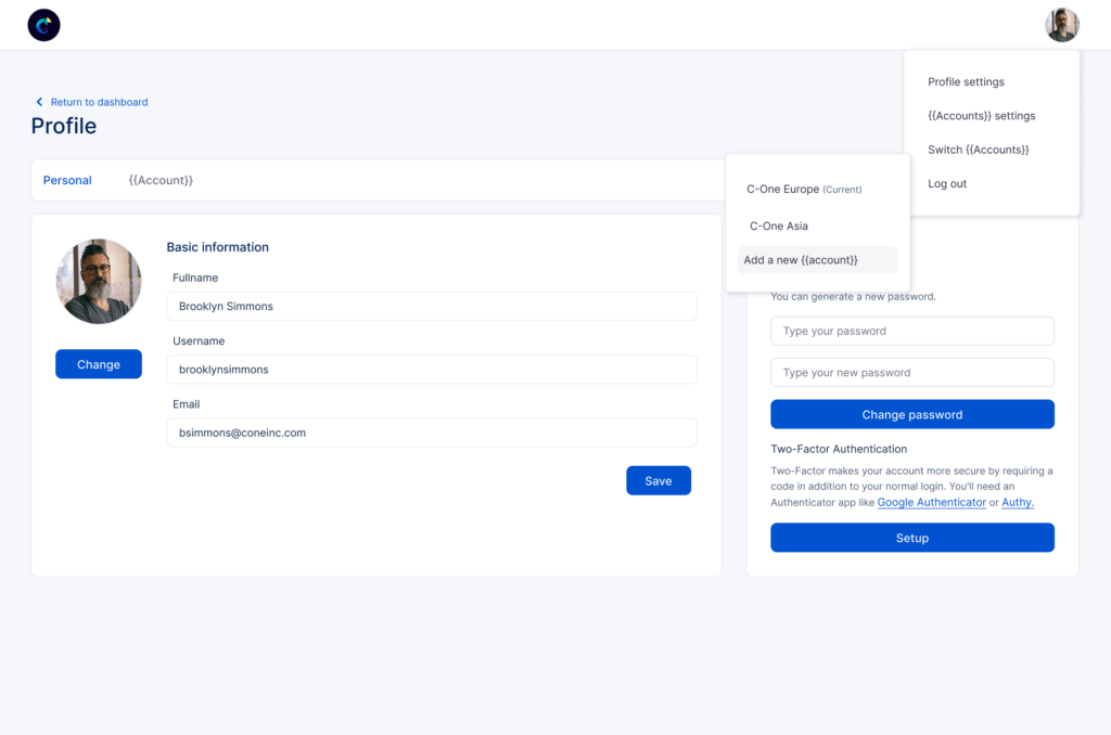
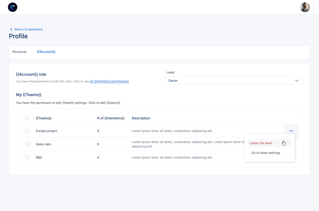
Add on, SAML Integration
Andrew asked me to work on SAML at the final stage, although SAML was in the midterm plans.
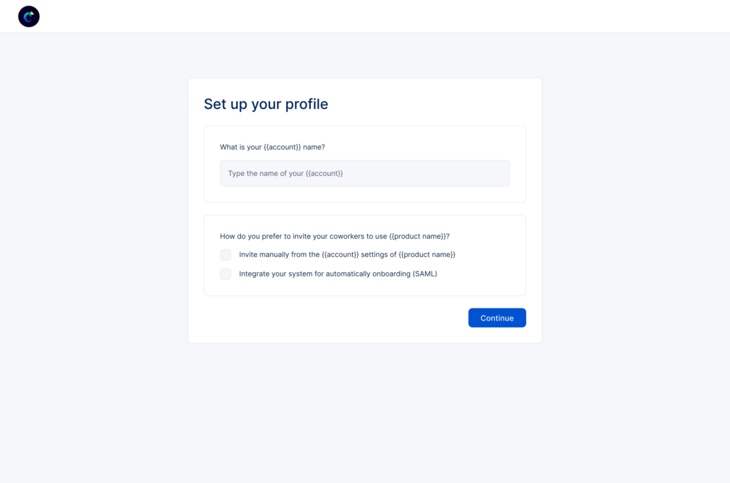
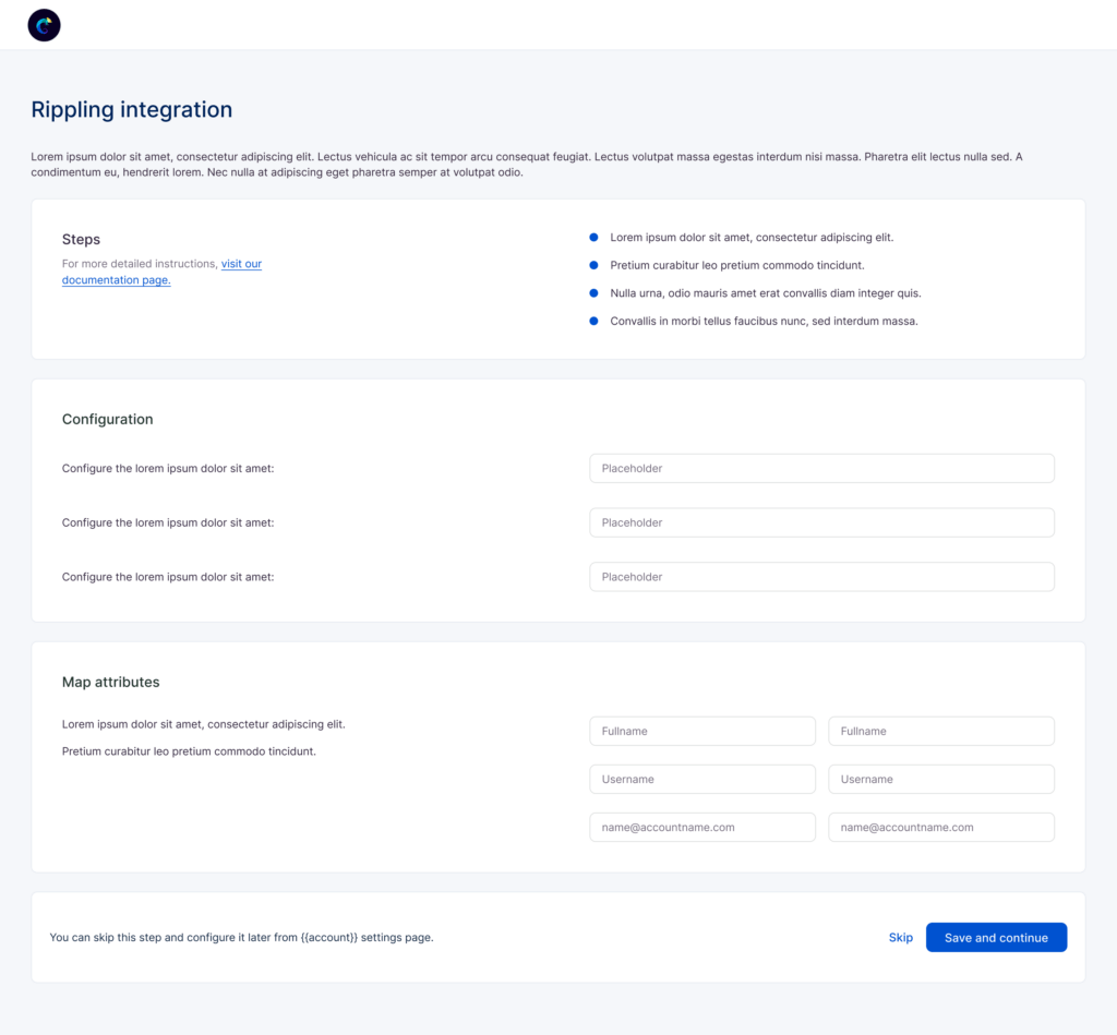
SAML, also known as enterprise SSO, is the feature that enables the users to gain access to the product that uses PropelAuth as authentication via their identity provider, like Google, Okta, or Rippling.
To integrate SAML into PropelAuth, I added a new section to the signup process. That has a different flow where CA makes identity provider configurations. CA also acquires a new SAML section in the account settings where CA customizes identity provider settings.
