Dragoman Diving & Outdoor
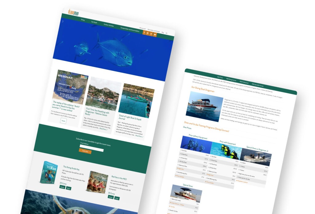
A responsive website for Mediterranean’s #1 diving center
Services
UI/ UX Design
User Research
WordPress customization
Platform
Responsive Website
Summary
Dragoman Diving & Outdoor is located in Kaş, Antalya, on the historical Lycian way, where there are astonishing outdoor routes and activities as well as many of the most beautiful diving spots.
The old website was the company’s first website which was build by their founders who are very eager to share their knowledge about the environment.
Although resembling a colorful billboard, it was basically a treasure with all the historical and technical information.
The first and immediate goal was redesigning the content architecture to serve the most important information with a clean and modern look.
The Goal
Creating a website with a simple content architecture.
Improving the user experience ın the reservation process.
Converting the site visitor into a long term customer.
Satisfy the curiosity of the readers with a blog.
Creating a clean and modern user interface.
User Research
We are chatting with our guests!
I used the opportunity of being face to face with the customers the whole summer.
The crew is already motivated and outgoing and very likely to chat with the guests, so I run the user research together with the crew.
So, I listened to the complaints as well as compliments of customers about the current website.
This way, I was able to narrow down customer expectations and the obstacles which they might encounter before, during and after their visit to Dragoman’s website.
After 60 days of research with approximately 50 guests per day, the following design problems were present:
The website is complicated.
There are lots of information so that visitors cannot reach the key info like the price, activity duration, scheduling etc.
The UI is unprofessional and not trustworthy.
The company founders who were in love with the content were convinced that the website should be motivating rather than satisfying.
Wireframes
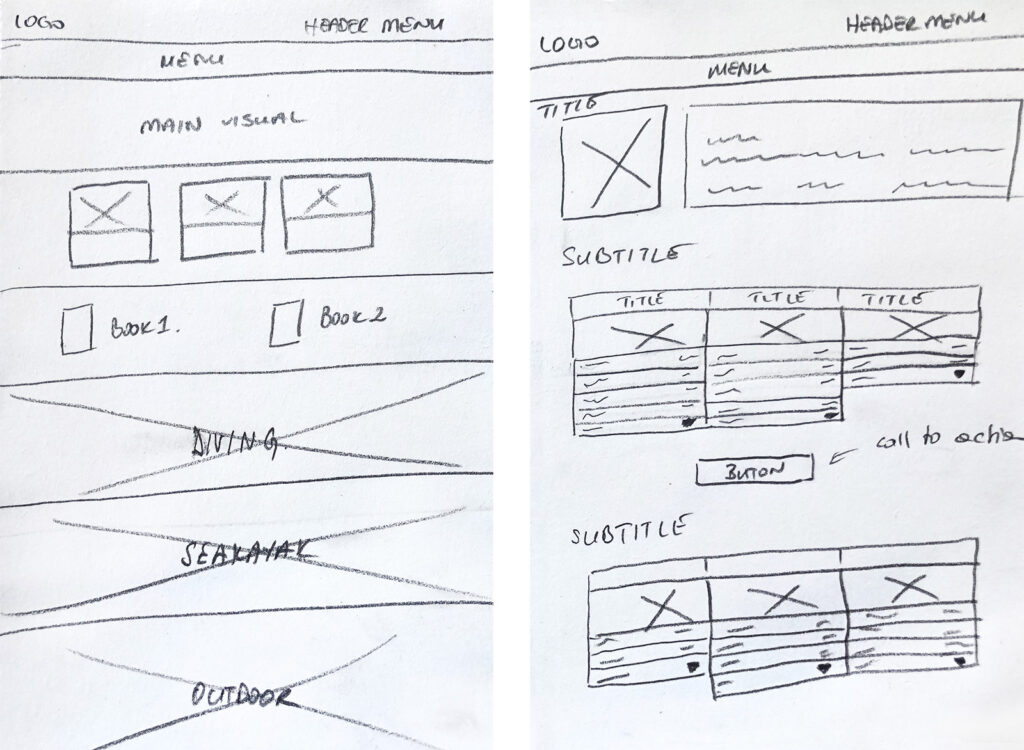
I redesigned first the content architecture
The main challenge in the redesign process was simplifying the content architecture.
The huge number and diversity of products in outdoor activities and the variety of diving courses needed extra analysis to categorize while keeping the overall design at the desired simplicity.
UI/ UX Design
I presented the products in a simple way
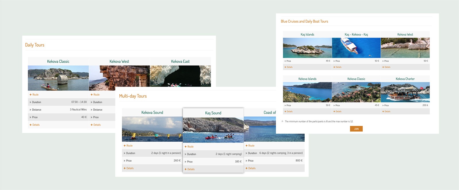
The goal was to display the huge amount of different tours and activities in a simple and compact way and to ease the first contact for reservations. I intended to accomplish this by using responsive accordion tables.
The price and activity duration is displayed at first sight and the details are readable by demand. At the end of each category, one can contact Dragoman team for further queries or to go ahead with the reservation.
User Survey
What do you like the most on the new website?
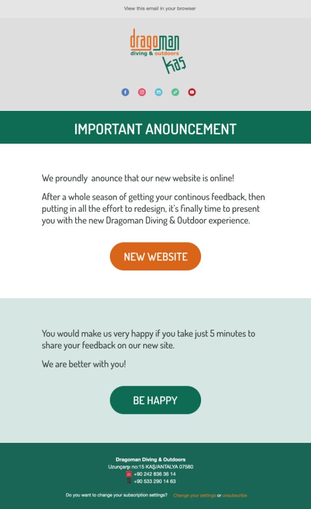
I prepared a questionnaire to get feedback on the new website and send it within the Dragoman’s bimonthly newsletter.
The survey returned 10 responses out of approximately 100 targeted.
Dragoman’s redesign received 9/10 positive feedback.
Top 3 adjectives were
simple, trustworthy, informative
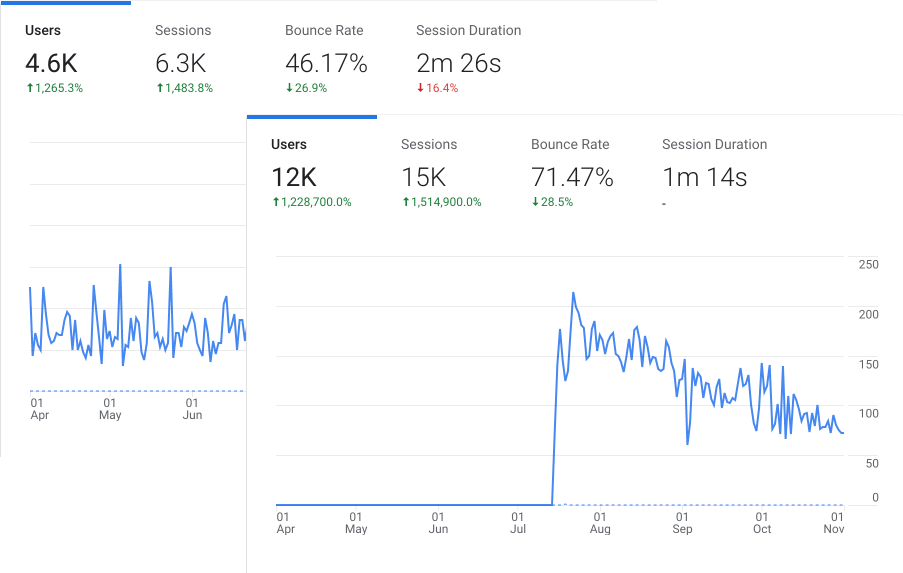
We have the analytics as approval
Site visitors increased from 4.6K to 12K within two seasons.
The reservation form usage tripled for the consequent season.
Confirmed bookings from the website doubled within one year.
